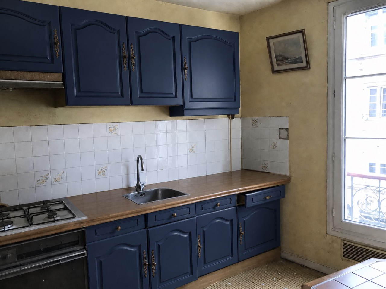
Painting cabinets is the biggest kitchen change you can make without a contractor — and the hardest color call in the house. Walls forgive; cabinets don't. They're the largest colored surface in the room, they sit against counters and floors you're probably not changing, and repainting them twice because the green went minty is a weekend nobody wants back.
So this guide works in the order the decision actually happens: first what has to stay, then the colors that keep proving themselves, then how to see a color on your own cabinets before you commit to it.
Start with what isn't changing
Cabinet color is a supporting actor to your counters, floor and backsplash. Before falling for a color, read the undertones of what stays: busy granite usually wants a quiet cabinet; warm wood floors flatter deep greens and creams; cool gray tile leans toward whites, navys and charcoal. The most common cabinet-paint regret isn't a bad color — it's a good color that argued with the counter.
The colors that keep earning their place
Whites and creams — the resale-safe default
Still the most-chosen cabinet color, and for defensible reasons: white maximizes light, suits every style, and doesn't scare buyers. Sherwin-Williams Alabaster (SW 7008) and Benjamin Moore Simply White (OC-117) are warm enough to avoid the lab-coat effect; go creamier if your kitchen gets cold north light.
Muted greens — the current favorite
Sage and gray-greens have moved from trend to staple. Sherwin-Williams Evergreen Fog (SW 9130) is the poster child — deep enough to feel intentional, gray enough to behave like a neutral. Greens love brass hardware and wood counters.
Navy — tailored and forgiving
Navy reads as a neutral in practice: it hides fingerprints better than white, pairs with marble and butcher block alike, and looks custom even on flat-pack boxes. Benjamin Moore Hale Navy (HC-154) is the benchmark. Navy on the island only — with white perimeter cabinets — is the classic low-risk entry.
Charcoal and near-black — the confident move
Sherwin-Williams Iron Ore (SW 7069) and its neighbors give a kitchen weight and edge, especially under lighter counters. They want decent natural light and something warm nearby — wood shelves, brass pulls — to keep the room from going stern.
Two-tone: the safety valve
- Dark lowers + light uppers keeps color from closing the room in — the eye reads the top half as wall
- A colored island against neutral perimeter cabinets delivers the trend at a fraction of the commitment
- Keep it to two colors; three reads as indecision
- Repeat the cabinet color once elsewhere — a stool, a runner — so it looks planned rather than left over
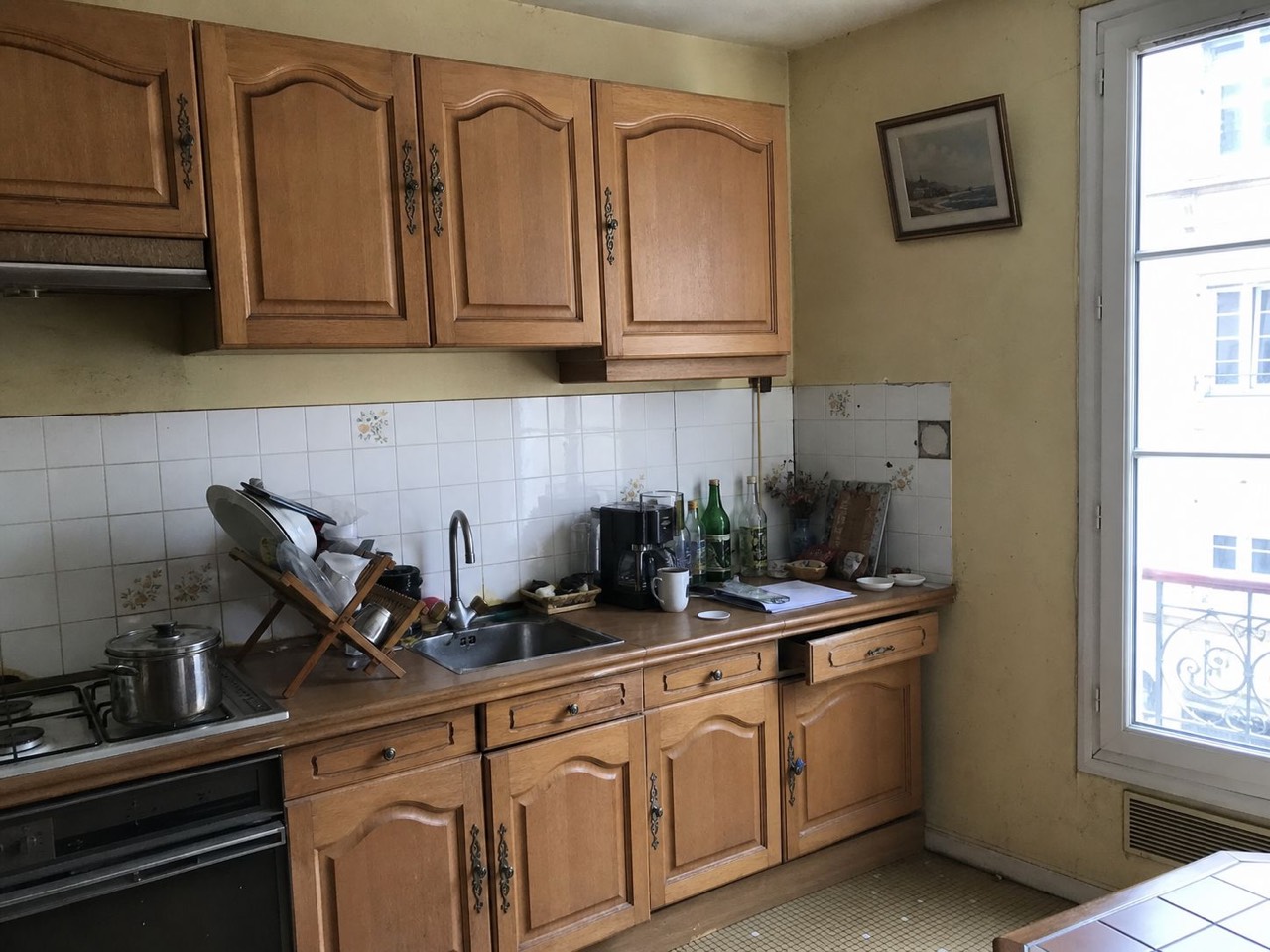 Before
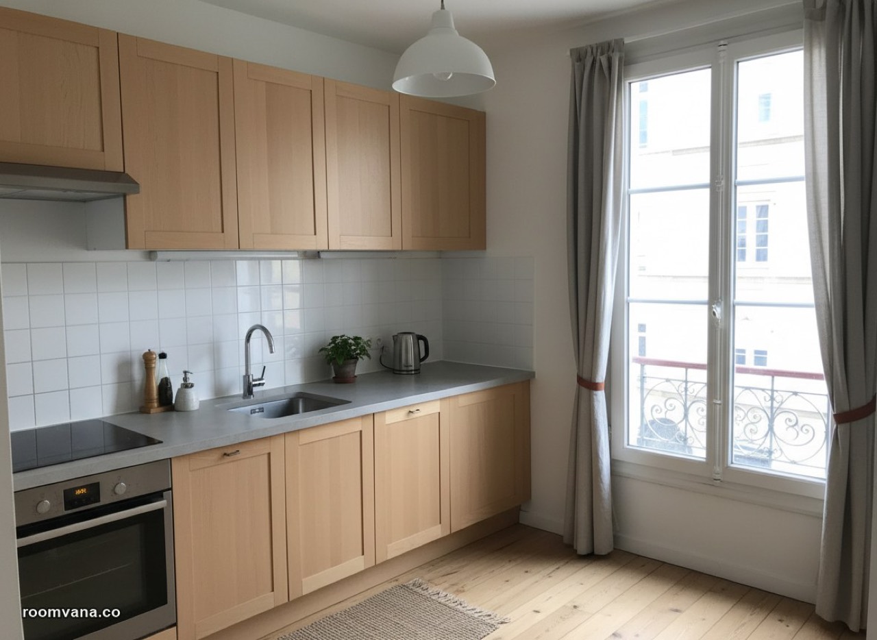 After
AfterPreview the color on your cabinets
This is the one paint decision where a preview earns its keep most, because the do-over cost is highest. Roomvana has a cabinet swap that recolors the cabinets in a photo of your actual kitchen — counters, floor and backsplash stay in frame, which is exactly what you're trying to figure out. The navy in the photo at the top of this post is that feature at work. A render takes about 30 seconds; run your top three colors and let two of them lose.
Before the brush comes out for real: cabinets are unforgiving of shortcuts, so whatever color wins, the sanding, priming and a proper enamel matter as much as the shade.
Try a color on your own cabinets
Snap a photo of your kitchen, upload it, and see the cabinets recolored in about 30 seconds. Google sign-in unlocks 3 free watermarked designs.
Recolor my cabinets