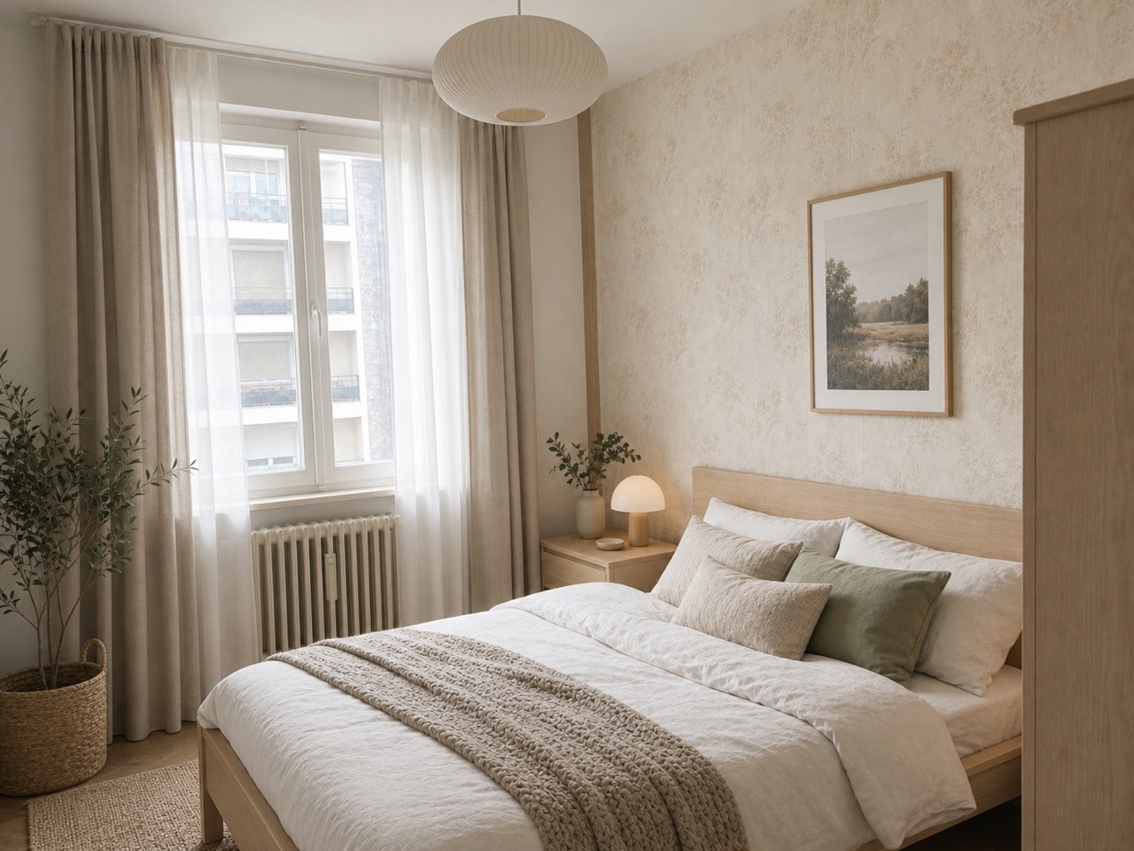
Greige is what happened when everyone got tired of choosing between gray and beige. It's the blend — a neutral with gray's composure and beige's warmth — and it has quietly become the default wall color of the last decade because it does what neither parent color can: it stays neutral in cool morning light and warm evening light alike.
The catch is that "greige" covers dozens of paints that look nothing alike on a wall. Some lean green, some lean pink, some go violet at dusk. This guide sorts the reliable ones, explains the undertone problem, and shows you a way to test a color on your actual walls before you're standing in the store holding a fan deck.
What is greige, exactly?
Greige is a neutral paint color that mixes gray and beige — cooler than a classic tan, warmer than a true gray. Because it sits between temperatures, it flatters both warm materials (wood floors, brass, linen) and cool ones (marble, black steel, chrome), which is why designers reach for it when a room has to hold a bit of everything.
The greige paints people keep coming back to
Every brand has its own lineup of greiges, but a handful have earned near-permanent spots on designer shortlists. Names and numbers, so you can sample the exact color:
- Sherwin-Williams Agreeable Gray (SW 7029) — the crowd-pleaser; balanced, soft, hard to get wrong in most light
- Sherwin-Williams Repose Gray (SW 7015) — a touch cooler and grayer; suits modern rooms and bright south-facing light
- Sherwin-Williams Accessible Beige (SW 7036) — the warmest of the group; reads as a modern beige with gray manners
- Benjamin Moore Revere Pewter (HC-172) — the classic; deeper than the others, with a green whisper that loves wood and stone
- Benjamin Moore Edgecomb Gray (HC-173) — light, airy, barely-there; the one to try when white feels stark but color feels like commitment
- Benjamin Moore Balboa Mist (OC-27) — pale and slightly lavender-leaning; elegant in bedrooms, worth watching at dusk
Undertones: where greige goes wrong
Every greige has a hidden lean — green, violet, pink, or yellow — that stays invisible on a paint chip and shows up the week after you've painted. The lean comes out when the color sits next to your actual floor, your actual sofa, your actual light. A greige that looks perfect in a south-facing showroom can turn purple in a north-facing bedroom.
- North-facing rooms cool everything down — pick a warmer greige (Accessible Beige territory) or it will read flat gray
- South-facing rooms warm everything up — cooler greiges (Repose Gray territory) hold their balance better
- Check the color against your floor and largest furniture piece, not against white paper
- Look at it at night under your actual bulbs — warm LEDs push greige toward beige, cool ones push it gray
Test on your walls before you sample
The old ritual — buy five sample pots, paint five squares, stare at them for a week — still works, but you can now shortlist before opening a single can. Roomvana's paint visualizer repaints a photo of your actual room, so you can run a warm greige and a cool one side by side on your own walls, with your own furniture and light in frame, in about 30 seconds each.
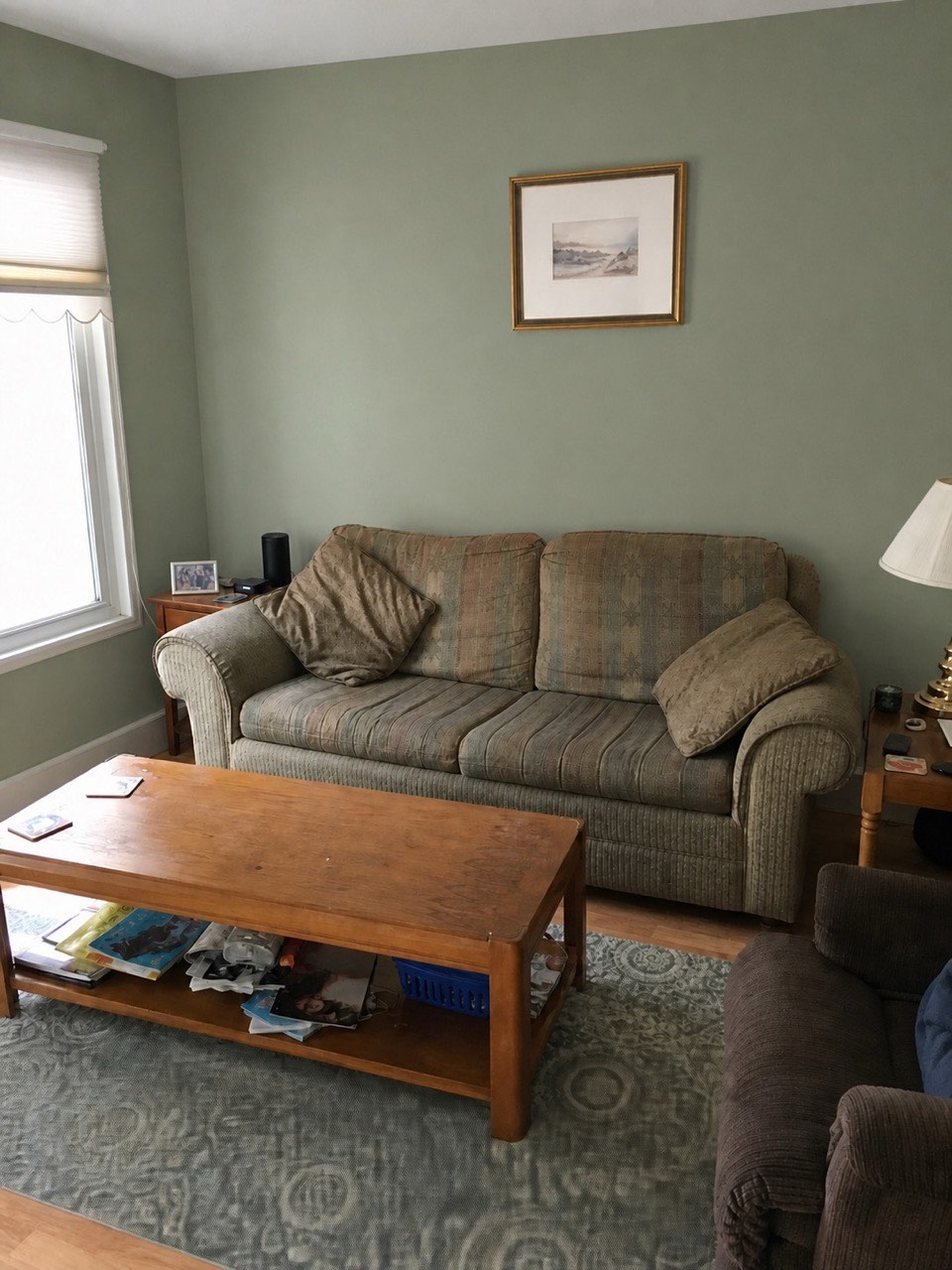
Use the render to eliminate, not to decide: knock out the greiges that clearly fight your floors, then buy sample pots of the final two. A screen can't reproduce your exact bulbs — the last call still belongs to paint on plaster.
What to pair greige with
- Trim: warm whites (creamy, not stark) keep the wall color soft; bright white trim sharpens it
- Wood: greige is famously kind to oak and walnut — it neutralizes orange undertones instead of amplifying them
- Accents: olive, terracotta, navy and black all sit comfortably on a greige base
- Whole-house use: greige is one of the few colors that can run through hallways, living rooms and bedrooms without going monotonous — shift one step lighter for small or dark rooms
See greige on your own walls
Upload a photo of your room and repaint it virtually in about 30 seconds. Sign in with Google for 3 free watermarked designs.
Try the paint visualizer